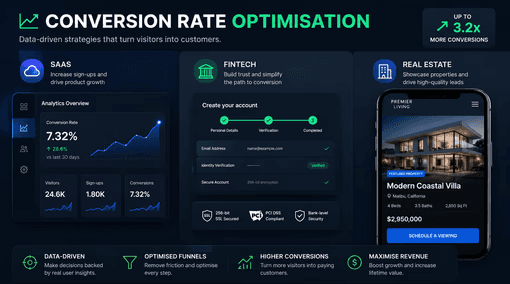
Why Your SaaS, Fintech, or Real Estate Website Is Losing Conversions (And How to Fix It)
You're spending on traffic. Paid search, content marketing, LinkedIn ads — the pipeline exists on paper. But somewhere between the first click and the conversion, users are disappearing.
The problem isn't your product. It's your conversion design.
In high-trust, high-consideration industries like SaaS, fintech, and real estate, the gap between a visitor and a converted lead is wider than in almost any other sector. Buyers are more cautious. The stakes — whether it's a B2B software contract, a financial product, or a property decision — are significant. And the websites serving these industries are often built for aesthetics or information rather than conversion.
This article breaks down exactly where conversion rate optimisation (CRO) fails in these verticals — and what you can do about it.
What Is Conversion Rate Optimisation, and Why Does It Matter More in High-Trust Industries?
Conversion rate optimisation is the process of improving your website so that a higher percentage of visitors take a desired action — whether that's starting a free trial, booking a demo, submitting a mortgage enquiry, or requesting a property valuation.
For most industries, the average website conversion rate sits between 2–5%. In SaaS, fintech, and real estate, the numbers can be significantly lower — not because the audience is less qualified, but because the buying decision requires more trust, more information, and more confidence.
This is precisely why CRO is not a nice-to-have in these sectors. It is a direct revenue lever.
A 1% improvement in conversion rate on a site receiving 20,000 monthly visitors could mean 200 additional leads per month. If your average deal value is £5,000, that is £1,000,000 in pipeline — without spending another pound on traffic.
That is the business case for conversion design.
The 5 Core Reasons High-Trust Websites Fail to Convert
1. The Value Proposition Is Unclear Above the Fold
The first 3 seconds of a visit determine whether a user stays or leaves. In that window, your website must answer one question: what do I get, and why should I trust you to deliver it?
Most SaaS and fintech homepages fail this test. They default to abstract language — "powering the future of finance" or "the operating system for modern teams" — that communicates nothing concrete.
Real estate sites often do the opposite: leading with a property search tool before establishing any reason to use your agency over a competitor.
The fix: Your headline should state the specific outcome your user will achieve. Not your features, not your brand story — their result. "Get mortgage-ready in 10 minutes" outperforms "The smarter way to buy a home" every time, because it is specific, outcome-focused, and measurable.
2. Trust Signals Are Absent or Misplaced
In SaaS, fintech, and real estate, trust is the purchase. Users are not just evaluating your product — they are evaluating whether you are a credible, safe, and reliable partner for something that matters to them.
Yet the most common pattern on these sites is to stack all trust signals — testimonials, logos, awards, regulatory badges — at the bottom of the page, well below the call to action.
This is structurally backwards. By the time a user reaches that section, they have already decided whether to convert or bounce.
The fix: Place your strongest trust signal immediately adjacent to your primary CTA. For SaaS: a recognisable client logo or a star rating. For fintech: an FCA registration badge or security certification. For real estate: a recent verified review or a sold-property statistic. The proximity of social proof to the decision point is a primary driver of conversion lift.
3. The Call to Action Lacks Specificity and Clarity
"Get Started." "Learn More." "Contact Us."
These CTAs are conversion killers. They ask users to take an action without communicating what happens next — and in high-trust verticals, ambiguity breeds hesitation.
Users who cannot predict what will happen when they click a button are significantly less likely to click it. This is a well-documented cognitive pattern in UX research.
The fix: Your CTA copy should complete the sentence "I want to..." from the user's perspective. "Start my free 14-day trial," "Book a 20-minute demo," "Get my free property valuation" — these CTAs convert better not because they are longer, but because they are honest and specific about what the user is committing to.
4. The Form Is Creating Unnecessary Friction
Forms are the final gatekeepers of conversion. They are also one of the most reliable places to destroy it.
In fintech, forms often ask for information that is only needed later in the qualification process — driving users away before they have even entered the funnel. In real estate, contact forms frequently request both a phone number and an email, creating a choice paralysis that results in neither being submitted.
The fix: Apply progressive disclosure. Ask only for what is essential at the point of initial conversion. A name and email, or a postcode and a preferred contact method, is usually sufficient to qualify and follow up. Additional information can be collected at subsequent stages. Every additional required field statistically reduces form completion rates.
5. The Mobile Experience Is an Afterthought
Over 60% of web traffic in most industries is now mobile. In real estate, the figure is often higher — driven by users browsing listings on commutes, during viewings, or in the evenings.
Despite this, a large proportion of SaaS, fintech, and real estate websites are designed desktop-first, with mobile treated as a scaled-down version of the primary experience. The result is cramped CTAs, tiny form fields, and hero sections that render the headline invisible on a 390px viewport.
The fix: Conversion design must begin on mobile. This does not mean a stripped-back experience — it means designing the conversion journey for a thumb-first, distraction-prone, intent-driven mobile user. Large tap targets, single-column layouts, and click-to-call functionality are not optional enhancements; they are conversion fundamentals.
CRO Considerations by Industry
SaaS
The SaaS conversion funnel typically has two primary objectives: free trial sign-ups and demo bookings. These require different design strategies.
For trial-led products, friction reduction is the primary goal. The fewer steps between landing and activation, the higher your trial-to-paid conversion rate. This means reducing sign-up form fields, eliminating the requirement for a credit card where possible, and ensuring the post-sign-up onboarding flow continues the conversion work your site started.
For demo-led products, credibility and qualification are the primary goals. Your site needs to communicate enough about the product's value — through case studies, feature specificity, and ROI-framed messaging — that high-intent buyers self-select into the booking flow.
Fintech
Fintech websites operate under a unique conversion constraint: regulatory compliance and user trust are in direct tension with conversion optimisation best practices.
Compliance requirements often demand lengthy disclosures, risk warnings, and multi-step verification flows that naturally increase friction. The CRO challenge in fintech is not to remove these — it is to sequence them correctly, so that trust is established before friction is introduced.
The most effective fintech conversion pages lead with benefit and outcome, establish credibility through regulatory credentials and social proof, and defer the detailed compliance information to later stages of the journey — present and compliant, but not obstructive.
Real Estate
Real estate conversion design presents a different challenge: users have multiple competing intentions. They may be browsing listings, researching valuations, looking for an agent, or seeking mortgage information — all on the same domain.
This multiplicity of intent is one of the primary reasons real estate websites suffer from high bounce rates. The site tries to serve everyone and ends up serving no one effectively.
The solution is audience-specific landing pages with clear intent segmentation — separate conversion paths for buyers, sellers, landlords, and investors — each with its own headline, social proof, and CTA architecture designed for that user's specific motivation.
A Framework for Prioritising CRO on Your Website
Rather than attempting to optimise everything simultaneously, use this prioritisation framework:
1. Identify your highest-traffic, lowest-converting pages. These represent the largest opportunity. Use Google Analytics or a comparable tool to find pages where volume is high but conversion is low.
2. Audit each page against the five failure modes above. Unclear value proposition, misplaced trust signals, weak CTAs, excessive form friction, poor mobile experience.
3. Form a single hypothesis per page. "If we move the testimonial above the CTA, conversion rate will increase because users will have social validation at the point of decision." One hypothesis. One variable. Measurable outcome.
4. Test before you redesign. Many conversion improvements can be validated through copy changes and element repositioning before any significant design investment is required. Validate the hypothesis before committing to a full redesign.
5. Measure at the metric that matters. Not bounce rate. Not session duration. The conversion event — the form submission, the trial sign-up, the demo booking. Every test should be measured against the primary commercial goal.
Final Thought: Conversion Design Is Not a Project. It Is a Practice.
The businesses consistently generating the highest conversion rates in SaaS, fintech, and real estate do not treat CRO as a one-time audit or an annual redesign project. They treat it as a continuous practice — testing, learning, iterating, and compounding improvements quarter over quarter.
A 0.5% improvement each quarter, sustained over two years, does not produce a 4% improvement. Through compounding, it produces something significantly greater. This is the commercial case for embedding conversion design into how your digital presence is built and maintained.
If your website is receiving traffic and not converting it at the rate your business requires, the gap is almost never the product, the price, or the market. It is the design of the conversion journey itself.
That is a solvable problem.
Want a conversion audit of your SaaS, fintech, or real estate website? Get in touch to find out where your biggest opportunities are.